
Imagine a donor walks into your office with $1000 cash in hand.
Do you take their donation? Do you make them stop at three different places before you accept it? Would you make them wander around your office to figure out who will accept it? No, of course not, you’d make it simple. The front desk is equipped to accept the donation or they guide the donor directly to the person who will.
Now think about your website in these terms. Rather than walk into your office the donor is at your website to give you that $1,000. How easy is it for them to find your giving page? Is it apparent from your home page without clicking a single thing? Is it one-click away?
Three-clicks, a questionnaire to answer, a donor account to create, and then they are on your giving page?
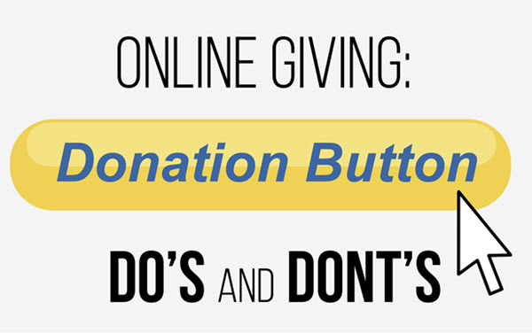
Below are some solid Dos and Don’ts when it comes to your Donation Button. Look them over and than ask yourself the two questions at the end of this article to assess your online giving flow.
Is it “Above the Fold”?
This means, is your donation button located at the top of your giving page and does not require your donors to scroll through your site to find it.
Does It Stand Out From The Rest?
Does your donation button contrast with your site in order to stand out and draw the visitor’s eye? The nonprofit sites listed below have done it a great job of making their Donation Button distinctive from the rest of their site’s navigation.
www.big-table.com
www.uniongospelmission.org
www.lifeatthecore.org
You’ll also notice that no matter where you go within their site the donation button is a constant. This is import for first time visitors to your site who are reading up on your organization. You never know when the impulse to give will strike and when it does there should be no confusion on where to click next to give you their hard earned money.
One Click is the Ideal
Your giving page should be one click away. The exception to this rule is when you want to break down the various engagement options (i.e., giving to a project, making a one-time donation, setting up a recurring gift, etc…). This can add value to the giving experience as long as each option provided has a donation button for them to engage with. If you have too many choices or the layout is confusing, your risk of abandonment grows – this is where the donor just closes their browser and walks away.
Don’t Let It Be All For Not
Remember, that $1,000 donation is there and could vanish if you make the donor search for your giving page or jump through too many hoops. Make it simple and easy. Now that you’ve read this far take a good look at your website and ask yourself these two questions:
- Is the Donation Button apparent from your home page and does it remain in the same location no matter where you go within your site?
- How can your online giving process be shortened by removing any unnecessary extra steps?
How easy can you make the process of accepting money from your donors?